The psychology of colour and its influence on human emotion and decision-making is as fascinating as it is controversial. We feel a deep connection to colours from as early as when our parents and teachers start asking, “what’s your favourite colour?” or even earlier in life as we are exposed to clothes and pigmented plastic playthings that caregivers deem appropriate for our gender. The thing is: the innate understanding of the “meaning” of colours leads to a host of pseudoscience and anecdotal evidence that marketing masterminds parlay into theories about its power of persuasion.
Maybe you’ve encountered those rainbow-streaked Pinterest infographics promising a pot of gold in the form of an “emotion guide” by which you should govern your branding decisions – saying things like “yellow means happiness” or “green means money.” You want your audiences to be happy and spend money on your product, so done deal, right? The truth is that colour is too dependent on individual and personal experience to be generalized into feelings or behavioural motivation.

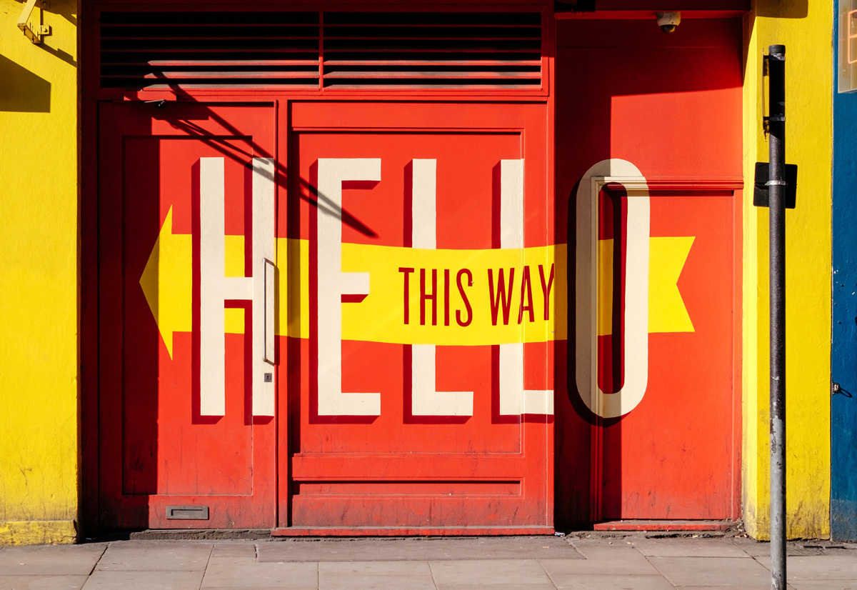
Certain patterns do emerge, however, with respect to judgments made about brands and colours, and research shows that snap decisions are made often based on colour alone. As you can imagine, cultural and societal forces push us to view colours with certain stereotypical lenses; we know that some colours are entrenched with political or gender-based inference, for example. The power of suggestion wielded by the concepts that co-opted them is stronger than the colour values themselves. We, as marketers, can’t always control these external factors, but we do need to be aware of them. We also need to pay special attention to what has already been done “in the space” where your brand or product will live. One strategy is to play into the psychological desire to detect differences and foster recognizability. If the competition all uses blue, perhaps you’ll stand out by using red, regardless of what red “means.”
In brand design, a relationship does seem to lie within the suitability and context of the colour being used, so ask yourself, “does the colour fit what I’m trying to communicate?” Colours can influence how audiences view the personality of a brand. When it comes to picking the “right” color, research has found that predicting consumer reaction to colour appropriateness is far more important than the individual colour itself. Some of the biggest tech brands in the world rely on cooler tones like blue and silver, complemented by neutral black and white as a way to convey the simplicity of their product experience — saying something about the brand itself and not about its users. More importantly, their words and imagery support this notion in a way that is infinitely more persuasive than the colour choice. Without this context, one colour is almost meaningless when compared to another, and there is little to no evidence that a royal, creative, wise purple will influence people’s buying decisions any more than a friendly, cheerful, passionate orange.
It’s the feeling and mood that your brand portrays that play a role in persuasion. It’s important to recognize that colours only come into play when they can be used to match a brand’s desired personality rather than trying to align with stereotypical colour associations. This is the true basis of genuine, emotional branding; because we process feelings about a product or service in very complex ways beyond just the colours it dons. Is your brand sincere, exciting, competent, sophisticated or rugged? You can usually narrow down to one of these core dimensions and while you may have an immediate colour association to assign to each of these facets, that obvious connection is lost without the supporting context that gives your brand a truly “colourful” personality. So hue are you, really?
Start with “why” you’re different and what kind of value you offer to your target audiences before picking your palette and that way, you’re sure to be golden.
Written By Cameron Arksey
Senior Creative Lead
www.red-rhino.com